
Boiled Down
The Home Cook's Pocket Companion
My Role
UX Designer
Timeline
10/2021 - 02/2022
Platform
iOS Mobile App

discover
Learning About The Problem & Who It Affects
As someone who cooks for herself just about every day, I’ve often thought about how frequently I, and others like me, find ourselves in a kitchen full of foods and ingredients, and think about how “there’s nothing to eat”. And past that, how often we all throw out foods because they’ve gone unused or uneaten for no real good reason.
These are dilemmas I believe are familiar to so many people just like myself, that I believe don't need to be problems that exist at all- especially not in the magnitude that they do.
Secondary Research
I conducted secondary research before I conducted any research of my own. Much of this research brought me to learn a lot about the massive problem of food waste in the United States, and how households and everyday people are the main culprits contributing to the waste.
I also found that there are a myriad of other reasons people are not using foods up and not operating as effectively in the kitchen as they could be, including:
-
Ambiguity of expiration dates on foods;
-
Lacking the time to cook; and
-
Absence of energy or motivation to cook
Competitive Analysis
I then moved on to looking into some of the current solutions that are available to users by existing companies; Yummly, BigOven, and Supercook seemed to be three of the top competitors out there that attempt to solve the same issue that I am.
All three of these sites offer tailored recipes & content to their users based on their dietary needs, tastes, and overall preferences. They also aid the user in executing these recipes, often times with the foods they already have in their kitchens.
User Interviews
Once I’d discovered what was already out there, it was time to begin my own primary research with potential users of the solution I intend to create.
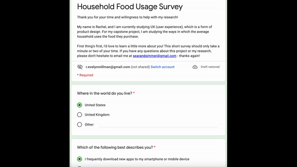
Through outreach and screening through an initial survey (shown here), I recruited 5 participants who I deemed most likely to experience this problem space. I conducted informal 30-minute interviews with each of them to learn about their habits, preferences, and pain points in the kitchen.
From these five unique interviews, 3 shared insights in particular stood out the most to me:
-
People want to feel inspired when deciding what to eat;
-
Lack of experience can lead to a lack of confidence; and
-
Convenience of a meal or recipe plays a huge role in
how people decide whether or not to eat at home
All of this discovery told me that if a majority of food waste is coming from households just like my own, and there are tons of reasons that people aren’t using up foods and cooking to their full potential, there has to be something that can be done to remedy this.
strategize
Understanding target users to imagine a solution
Personas
To more concretely envision the users I wanted to help with my product, I created two personas to represent the two groups I was targeting.

"Cooking Sherry"
Age: 34
Goals:
-
Feed herself and her family
-
Use the foods in her kitchen
-
Improve & refine recipes each time she makes them
Pain Points:
-
Lacking time to cook in her busy day
-
Adhering to her family's dietary needs & preferences

"Hungry Harry"
Age: 25
Goals:
-
Prepare meals that are tasty and easy to make
-
Make accurate portions of food
-
Improve skills in the kitchen
Pain Points:
-
Doesn't feel confident enough with his cooking to eat how he'd prefer to
-
Preparing food in excess that often goes to waste
User Stories
By developing user stories, I could clearly articulate what my users need to do in order to accomplish different tasks, and why they want to accomplish those tasks in the first place. The four primary stories I decided to focus on were these:
"As a user, I...
-
...want to easily find recipes so I can feed myself and others;
-
...want to learn how to cook so I can make the foods I like;
-
...want to save recipes so I can find & reference them later; and
-
...want to interact with others to hear their thoughts & ask questions"
Then, I brainstormed how my users would accomplish
their tasks in the app, and how the solution was really
going to manifest itself. I used an affinity mapping
process with sticky notes on my office wall to get all
of my ideas documented, and from there, I could
categorize and narrow my ideas down.
After considering all of the possibilities I brainstormed, I
realized that building confidence and having a knowledge
base was the true key to being able to not just effectively
use the food in your kitchen, but to be excited about using
that food to make something you’re proud of.
So, I decided to create a gamified cooking app that allows
users to learn how to cook at their own pace, store the
recipes and resources they discover, and communicate with
other users to get opinions and advice.

The Solution
User Flows
I then took my user stories and considered them further in the context of an app: what exactly would a user do to complete the tasks they want to accomplish? And what routes can they take to complete those tasks?
I identified three critical tasks to the user experience that practically every user in the app would complete - Creating an account, Completing a level, and Posting on a Forum - and mapped out user flows to conceptualize what carrying out these tasks would look like.

Create An Account Flow

Complete a Level Flow

Post on Forum Flow
Create An Account Flow
Sitemap
I created a sitemap to organize the content of the site and determine what pages and screens would exist and need to be designed. This allowed me to better visualize how the app and its content would be structured, and also helped me determine through several iterations what pages and structures are truly necessary.

design
Bringing the Solution to Life
Sketches
From here, now that I knew what the user goals were and how they could be accomplished, I could finally begin to bring the idea to life through design. The first step was taking to pen-and-paper to draw sketches of a few screens to show the general structure of what I envisioned the app to be.


Wireframes
The visual design process progressed by taking those sketches and transferring them to a digital setting as wireframes; these low-fidelity designs provided the foundation for the overall UI and a more detailed visual of the structure and general functionality of the app.

Style Guide
I also created a style guide for the app that established Boiled Down's brand color palette, iconography, fonts and sizes, and all of the UI elements like buttons, headers, navigation bars, and grids.
The style guide evolved as the design did, and it was a massive help in seamlessly maintaining consistency and functionality throughout the design process.


Prototype
After over a month of additional research, studies, and further design, Boiled Down evolved to become a completely fleshed-out, high-fidelity model of the MVP. These mockups showcase what the actual initial release of the product would look like.
Once each screen of the high-fidelity designs was created, I animated transitions between screens and created interactive elements within the designs to make these not just beautiful UI, but a fully functional prototype.
evaluate
Reviewing the Design to Deliver the Best Possible Product
Usability Testing
Boiled Down was ready to be put in the hands of real users to see how well it would actually work and how well it would help users solve the problem that was identified at the very beginning. Testing at this stage consisted of two rounds of tests with 5 participants per round.
The first round gave me generally very positive feedback, along with some hugely valuable insights that I would implement into the design before moving on to the second round of testing. Most notably, I received some comments about some word choices within the app that could be improved, and how some of the design elements' purpose could be made more obvious to the user.
I refined my designs based on the feedback I received, and then conducted the final 5 tests. I again got generally very positive feedback: no major or even significant usability challenges were identified, and I received multiple comments about how the simplicity of the app was much appreciated. Many users seemed to enjoy and feel put at ease by the lack of cognitive overload, and I even had one test user tell me that they wished this was a real app so they could look through more of the content!

"I really want to go cook now, I'm excited!"
- a real Boiled Down test user
final thoughts
Cheers to the Home Cook
Throughout this project, a quote from the Disney movie Ratatouille kept playing in my head: "anyone can cook". My goal all along was to make anyone and everyone believe they can cook and help them enjoy doing it, and I'm proud of the solution I've designed.
While I'm confident in Boiled Down's viability as a product on the market, even when it's functional, beautiful, and delightful - a product is never truly finished. I plan to continue collaborating to create content and expand the gameplay function in the app, as well as polishing the design as I continually get user feedback.